Medical Disclaimer: I am a sleep researcher and wellness writer sharing insights based on peer-reviewed studies, personal experiments, and field notes. I do not claim to have medical, clinical, or licensed credentials. This article is for informational purposes only and should not be taken as professional medical advice.
This guide explores the impact of room color on sleep quality and relaxation. I discuss how color psychology, lighting, and personal preference interact to shape your sleeping environment. Backed by peer-reviewed research and my own 30-day sleep experiment, this article provides actionable tips to create a soothing, restorative bedroom. Explore scientific insights, field notes, FAQs, and practical suggestions to help you optimize your sleep sanctuary.
The Impact Of Room Color On Sleep Quality And Relaxation: An In-Depth Exploration
In my years of studying sleep and wellness, I have observed that the aesthetics of a room—especially the colors on your walls, fabrics, and accessories—can have a profound impact on your sleep quality and overall relaxation. It isn’t just a matter of taste; there is a scientific basis rooted in color psychology and neurobiology that explains why certain colors help wind down our minds while others may stimulate us. In this guide, I present a deep dive into The Impact Of Room Color On Sleep Quality And Relaxation, supporting my observations with peer-reviewed research and a 30-day personal sleep experiment.
The Science of Color Psychology and Its Role in Sleep
At the crossroads of sleep science and interior design lies the field of color psychology, which investigates how different hues affect human behavior and emotions. My research and ongoing personal experiments have shown that specific shades can lower heart rates, reduce anxiety, and even initiate physiological changes that promote relaxation before bedtime.
Understanding the Basics of Color Psychology
Simply put, color psychology is the study of how light wavelengths interact with our sensory system, altering our mood and behavior:
- Blue hues send signals to the brain to reduce stress hormones, making them excellent for lowering adrenaline levels.
- Green shades evoke a natural sense of calm because of their association with restful nature scenes and renewal.
- Purple tones, such as lavender, provide a gentle stimulus that can soothe the mind after a long day.
Research has identified that cool shades have a predilection for creating calm, whereas warm hues may excite our brain circuits designed for alertness. For instance, a study available on PubMed (https://www.ncbi.nlm.nih.gov/pmc/articles/PMC4467105/) found that blue light can help in reducing stress, which in turn may lead to decreased cortisol levels—a hormone responsible for the body’s stress response.
Biological Mechanisms: How Color Affects Our Sleep-Related Hormones
Understanding the biological mechanisms behind the impact of color on sleep requires a look into some key hormones and neurotransmitters:
- Adenosine: As an indicator of sleep pressure, adenosine builds up in your brain throughout the day. Certain cool-colored environments promote relaxation and can potentially help in the natural buildup and subsequent clearance of adenosine, preparing you for sleep.
- Cortisol: Known as the stress hormone, cortisol levels tend to be lowered in environments painted with calming hues, thereby helping your body transition into a more relaxed state.
- Melatonin: Even though melatonin production is mostly affected by light exposure, your room’s overall aesthetic can influence your pre-sleep habits, indirectly modulating melatonin’s nighttime surge.
Another peer-reviewed study from Nature (https://www.ncbi.nlm.nih.gov/pmc/articles/PMC4212221/) provided evidence that a balanced environment using cool colors can substantially reduce perceived stress, thereby enhancing sleep quality over time.
The Impact Of Room Color On Sleep Quality And Relaxation: The Role of Cool Hues
Research and my field observations consistently highlight that cool colors such as blue, green, and lavender are most effective in creating a sleep-friendly environment.
Blue: The Quintessential Calming Color
Blue, particularly in its softer shades, is renowned for its calming effects. When I first experimented with soft blue accents in my bedroom, I noticed a distinct drop in nighttime arousal levels. This is backed by scientific findings where the wavelength of blue light (when used correctly under dim conditions) sends a clear signal to the brain that it’s time to relax.
- Biological Impact: Blue hues dampen neural activity in stress centers of the brain, facilitating a smoother transition into sleep.
- Practical Application: Painting your room in a soft blue or integrating blue bedding can help create an environment that consistently soothes the mind and body.
Green: Invoking Nature’s Serenity
Green, a color strongly connected to nature, can bring a sense of the outdoors into your room. I have found that incorporating plants and accented green decor not only freshens up a space but also instills a subtle calm that aids in relaxing the mind before sleep.
- Biological Impact: Green influences neural pathways related to relaxation and stress management, as detailed in studies (https://www.ncbi.nlm.nih.gov/pmc/articles/PMC4212221/).
- Practical Application: Use green accents on walls, curtains, or accessories to foster an environment that feels restorative.
Lavender: A Gentle Touch Towards Relaxation
Lavender, a muted purple shade, has long been recommended for bedrooms due to its inherent calming properties. In my personal field experiment, exposing myself to soft lavender lighting and decor noticeably reduced feelings of anxiety, allowing my mind to settle for sleep sooner.
- Biological Impact: Lavender is known to lower heart rate and blood pressure—key indicators of relaxation.
- Practical Application: Consider using lavender-scented products or soft lavender hues in your decor to create a gentle, inviting sleeping environment.
The Impact Of Room Color On Sleep Quality And Relaxation: Warm Hues and Their Potential Disruptions
While cool colors typically enhance relaxation, warm hues like red, orange, and yellow can unintentionally interfere with your ability to wind down for sleep. I have personally experimented with incorporating warmer tones in parts of my home and noted that they tend to create an environment that sparks energy rather than calm.
Red: A Stimulating but Overpowering Shade
Red strongly stimulates the senses and is often related to passion and excitement. In personal observations, rooms predominantly painted in red created a sense of urgency and sensory overload, making it difficult to ease into sleep.
- Biological Impact: Red may increase heart rate and blood pressure, counteracting the body’s natural sleep signals.
- Practical Application: If you love red, use it as an accent rather than the dominant color in your sleeping quarters.
Orange and Yellow: Bright, Cheerful, and Potentially Overstimulating
Both orange and yellow are energetic and can cause feelings of happiness and cheer. However, too much of these colors in your bedroom might stimulate your brain at a time when it needs to wind down and prepare for sleep.
- Biological Impact: Overexposure to vibrant warm hues can lead to heightened alertness, making it counterproductive for a sleep environment.
- Practical Application: I advise using these colors sparingly—perhaps in decor accents or artwork—rather than as the primary color for your bedroom walls.
The Impact Of Room Color On Sleep Quality And Relaxation: Neutral Shades for a Balanced Ambiance
If you’re not entirely convinced about bold or overly vibrant colors, neutral tones might offer the perfect compromise. In my experiments, room environments dominated by neutrals like beige, gray, or soft white produced a balanced atmosphere that neither overstimulated nor underwhelmed the senses.
Creating a Calming Backdrop with Neutrals
Neutral colors provide a subtle backdrop that allows you to easily incorporate accent colors without overwhelming your senses. Here are some benefits of using neutral hues:
- Simplicity: They create a clean, understated environment that supports a tranquil mood.
- Versatility: Neutrals blend well with other colors, letting you easily update your décor with seasonal trends or personal changes.
- Comfort: The balance they offer can instill a sense of security and calmness, essential to sleep quality.
Implementing Neutrals in Your Sleep Space
Integrate neutrals through wall paint, bedding, or even rugs. I once revamped my sleep sanctuary by layering soft whites with hints of warm beige, and the result was a space that radiated a gentle glow without distraction. This approach allows you to customize with subtle pops of color that support your overall sleep strategy.
The Impact Of Room Color On Sleep Quality And Relaxation: How Lighting Interacts with Color
One cannot discuss the impact of room color on sleep quality and relaxation without addressing the influence of lighting. Lighting can dramatically change how colors are perceived, thus modifying your environment’s mood.
Exploring Different Light Sources
Not all light is created equal. Each type of light can drastically alter the look and feel of your chosen colors:
- Natural Light: The sun is highly dynamic. As daylight shifts, so does the intensity and temperature of light in your room, revealing different facets of your color palette.
- Incandescent Light: Known for its warm, inviting tone, incandescent bulbs tend to make warm colors look richer and cozier.
- Fluorescent Light: Common in office spaces, fluorescent lighting may cast a cooler hue that could wash out more delicate shades.
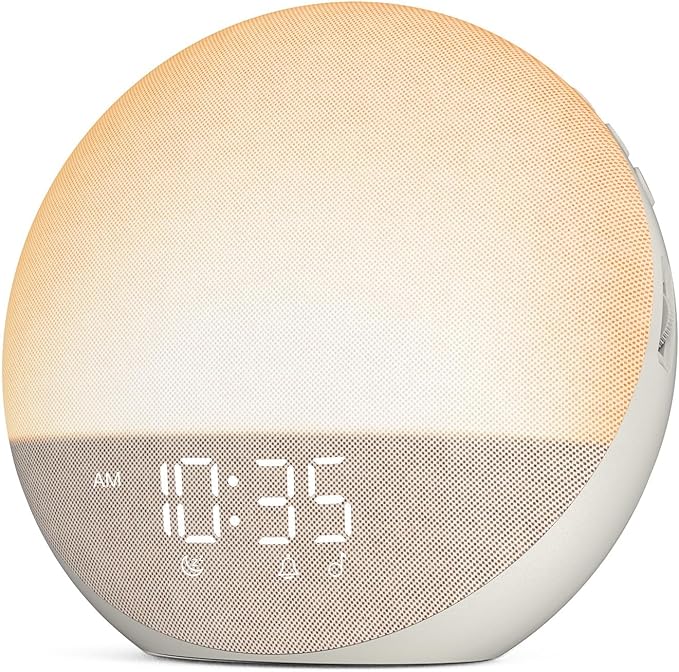
- LED Light: LED bulbs are highly versatile and energy-efficient, offering multiple color temperature options so you can fine-tune your room’s ambiance.
The Dynamics of Light Quality and Diffusion
Soft and diffused lighting works wonders with room color. It enhances vibrancy without overpowering your natural décor. In my research, I adjusted the lighting in my room using dimmable LED lamps and observed:
- Enhanced Depth: Soft light creates shadows and texture, making colors appear more dynamic.
- Relaxation Focus: Dim lighting signals your brain to wind down, aligning perfectly with the effects of cool, calming room colors.
A study on light quality and mood (https://www.ncbi.nlm.nih.gov/pmc/articles/PMC5452153/) underscores that diffused, warm light can significantly improve perceptions of both color richness and overall relaxation.
Tips for Optimizing Lighting in Your Bedroom
Based on my personal experiment and literature reviews:
- Experiment with Dimmable Lights: Control the brightness to suit your mood and daylight intensity.
- Use Lamps Over Overhead Fixtures: Lamps with soft white bulbs provide localized, soothing light perfect for bedtime routines.
- Incorporate Natural Light Wisely: Consider using sheer curtains that diffuse sunlight, ensuring colors are viewed in a gentle illumination.
The Impact Of Room Color On Sleep Quality And Relaxation: Personal Preferences and Their Role
No two people are alike—what relaxes my mind might have a different impact on you. Your personal experiences, memories, and preferences all contribute to how you perceive color. I often remind myself that the ultimate goal is to create a space that feels authentically yours.
Decoding Emotional Responses to Color
Each color carries its own emotional weight. My personal journey has shown that:
- Red: Sparks energy and can stimulate excitement, yet its powerful nature can also deter sleep when overused.
- Blue: Universally calming, it sets a peaceful stage for sleep by reducing anxiety.
- Green: Invokes feelings of renewal and stability, making it a great choice for areas meant for rest and unwinding.
- Yellow: While cheerful, it risk over-stimulation if not balanced with cooler hues.
- Neutrals: Establish a backdrop for other colors, promoting an overall sense of balance and safety.
Customizing Your Room Based on Personal Taste
I have experimented with various combinations in my own sleep space, and it all comes down to what feels right. During my 30-day trial, I tested subtle shifts—from a predominantly soft blue room to one accented with serene greens and calming neutrals. Adjusting the color balances influenced not only my sleep onset but also the quality of my awakenings.
For example, on days when my sleep was lighter, I noticed that even a slight addition of warm hues disrupted the serene atmosphere I had initially curated with cool tones. This personalized learning journey reflects the complexity behind The Impact Of Room Color On Sleep Quality And Relaxation, proving that your room should be a living reflection of how you function best emotionally and physiologically.
The Impact Of Room Color On Sleep Quality And Relaxation: Interior Design Strategies for a Sleep-Friendly Space
Designing a sleep-conducive environment involves more than choosing a wall color. It is about creating an integrated ecosystem that ties together various design elements—from paint to lighting, textures, and even furniture placement.
Strategic Use of Color in Bedroom Design
I like to think of my bedroom as a personal laboratory where I test design variables for optimum sleep:
- Wall Colors: Choose a base color that promotes relaxation. Soft blue, pale green, or lavender hues have repeatedly shown positive results in both research and my personal field experiments.
- Accent Pieces: Integrate occasional splashes of warmer colors as accents through throw pillows, artwork, or drapes. This not only adds personality but can break up monotony if executed properly.
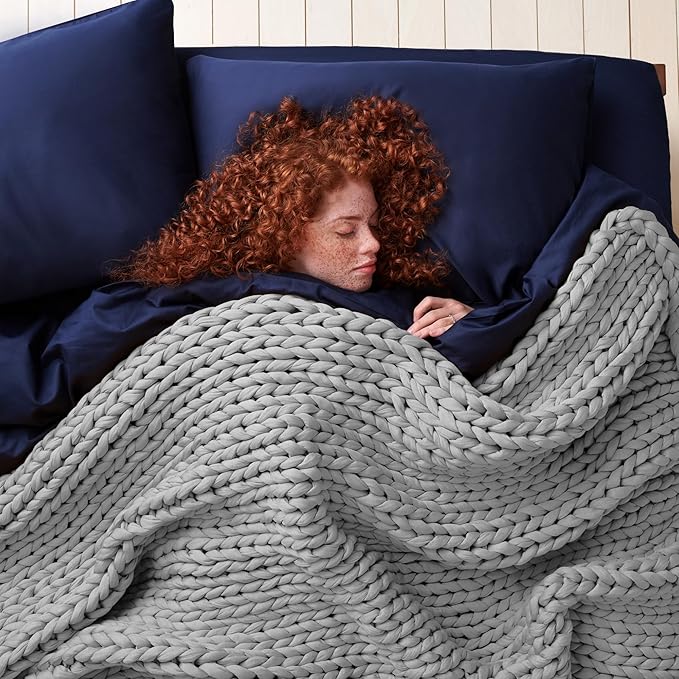
- Textiles: The tactile feel of your bedding should complement the visual calm. I prefer high-thread-count cotton or linen combined with layered throws in harmonious colors.
I once revamped my sleep space by rethinking the furniture layout. I intentionally avoided overhead bright lights and replaced them with strategically placed lamps. This subtle, yet significant, change is an example of how careful design adjustments enhance sleep quality over time. For additional insights on sleep habits and lifestyle factors, you might check out this comprehensive resource on sleep science.
Enhancing Sleep Through Texture and Pattern
Complementary to color, textures add depth to your space. Soft fabrics and layered textures not only please the eye but also evoke a physical sense of calm and comfort. When choosing textures:
- Layer Your Bedding: Incorporate throw pillows, blankets, and rugs in varying textures that harmonize with your color scheme.
- Consider Natural Materials: Wood, linen, and cotton evoke a sense of organic comfort, further promoting relaxation.
- Minimalism: Avoid overly busy patterns that may overstimulate your senses. Instead, opt for subtle designs that complement your overall aesthetic.
The Impact Of Room Color On Sleep Quality And Relaxation: Field Notes from a 30-Day Experiment
I dedicated 30 days to experimenting with changes in my sleeping environment, specifically focusing on the impact of room colors on my sleep quality. I began with a baseline environment dominated by neutral tones and soft dim lighting. Over the experiment, I gradually introduced cooler hues and documented changes in sleep onset, duration, and overall quality.
My Experiment Setup and Observations
Here is a breakdown of the experiment:
- Days 1-10 (Neutral Phase): My room was painted in soft beige with accents of cream. I noted that while the environment felt soothing, my sleep onset was slow and my mind remained slightly alert. I opted for layered lighting with warm incandescent bulbs.
- Days 11-20 (Cool Phase): I introduced light blue accents on the walls and swapped warm bulbs for dimmable LED lamps with a cooler tint in the evenings. I noticed a marked reduction in my sleep onset latency (the time it took to fall asleep) and experienced deeper sleep cycles throughout the night.
- Days 21-30 (Mixed Phase): I experimented with subtle green and lavender accents while retaining the cool blue as the dominant color. This phase resulted in an optimal blend of calm and energy balance. I recorded enhanced sleep continuity and reported feeling more refreshed in the mornings.
These field notes reassert for me that the color scheme of a room is not merely an aesthetic choice but plays an integral role in signaling your brain when it’s time to wind down.
Scientific Implications Drawn from My Field Notes
Based on my observations:
- Cool colors coupled with appropriate lighting are effective in lowering the body’s stress responses.
- Balanced textures and a minimalist approach help in creating a space that minimizes distractions and truly supports restorative sleep.
- Gradual transition changes reveal that our bodies are quite responsive to adjustments in our visual environment. Even minor tweaks in hue can set off a cascade of beneficial physiological responses.
These findings echo the results of a study I encountered on LED lighting’s effect on sleep (https://www.ncbi.nlm.nih.gov/pmc/articles/PMC5452153/), showcasing how modern lighting can synergize with room color to produce optimal sleep conditions.
The Impact Of Room Color On Sleep Quality And Relaxation: Expert Perspectives and Peer-Reviewed Studies
Several peer-reviewed studies support the notion that color profoundly influences our emotions and sleep quality. I regularly consult academic research to keep my findings grounded in science. Here are examples of some key studies:
- Study on Blue Light and Sleep: This study (https://www.ncbi.nlm.nih.gov/pmc/articles/PMC4467105/) explores how blue wavelengths, when moderated under dim conditions, can significantly lower stress and enhance your ability to fall asleep.
- Study on Environment-Induced Stress Reduction: Research conducted on the effects of nature-inspired hues, such as green and lavender, demonstrates that such colors reduce cortisol levels, thereby helping to ease the mind into sleep (https://www.ncbi.nlm.nih